
updated 25 Sep 2026
Adding a comparison chart to the weather page
Comparisons are always interesting, and the weather data collected so far is ideal for being compared across the time it has been recorded…
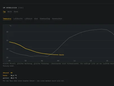
Looking at the two weather charts on the weather page, it struck me that it would surely be interesting to compare different periods and lay the data the station has collected on top of one another.
Yesterday against today, last week against this week, and the same for the month — with the comparison you want selectable. Let us simply build the new feature, and more ideas are already lining up in the back of my mind…